Linear's Issue Detail View: a teardown of the March 2026 refresh
A four-dimension teardown of Linear's Issue Detail View after its March 2026 UI refresh — mapping a five-tier attention stack, reading changelog entries as a design spec, and cataloging the micro-interactions that express Linear's operating model.
On March 12, 2026, Linear designers Charlie Aufmann and Maxime Heckel shipped a UI refresh guided by two principles: "Don't compete for attention you haven't earned" and "Structure should be felt not seen." 1 Most users didn't immediately notice the changes — which, by the team's own measure, is exactly the point. 1 This teardown breaks the Issue Detail View into four dimensions to show what those principles actually look like in practice.
Information hierarchy: a five-tier attention stack
The Issue Detail View operates on a strict visual priority gradient. Read it from top to bottom:
- Issue title and body — largest type, highest contrast, center stage. This is where users do work; everything else serves it.
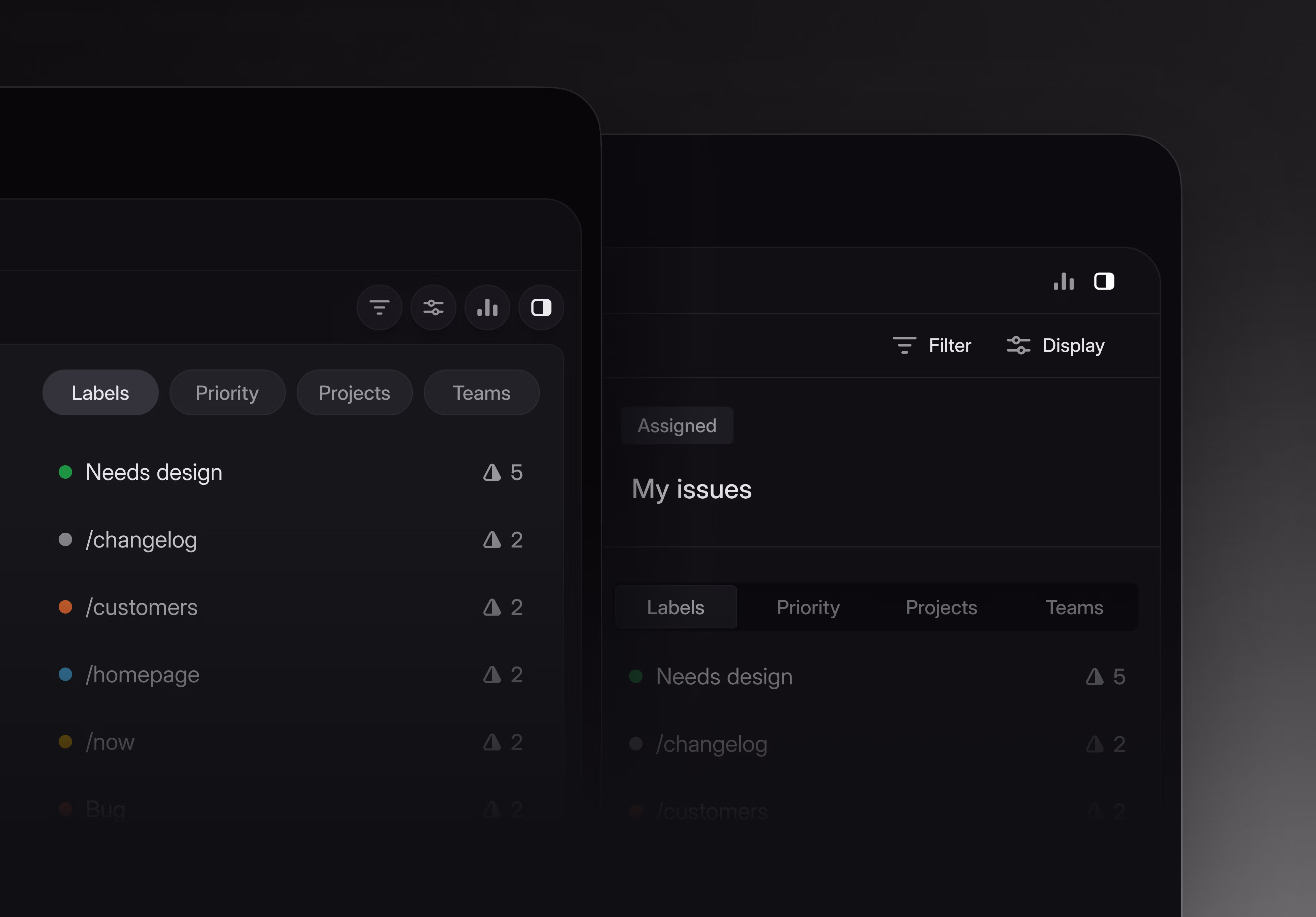
- Attribute tags — status, priority, assignee, labels — compact, icon-assisted, directly below the title. Editable on click, but not demanding attention until needed.
- Global tab bar — previously full-width across the top of the app. After March 12, it was compressed into rounded, icon-only pills that no longer span the full screen width. 1
- Navigation sidebar — dimmed several notches; icon sizes reduced; inactive text color muted. 1 Karri Saarinen (Linear co-founder) described the old sidebar as appearing "visually prominent even after a user had reached their destination" — the updated version lets the main content area take precedence. 1
- Structural chrome — borders and separators. More on these in the whitespace section.
The move that carries the most design intent is tier 4. Sidebars are conventionally loud — product navigation is expensive real estate, and there's pressure to make it visible. Linear's reasoning is that once you've arrived at an issue, the sidebar's job is done. Keeping it at full brightness competes with the content you opened the app to work on.
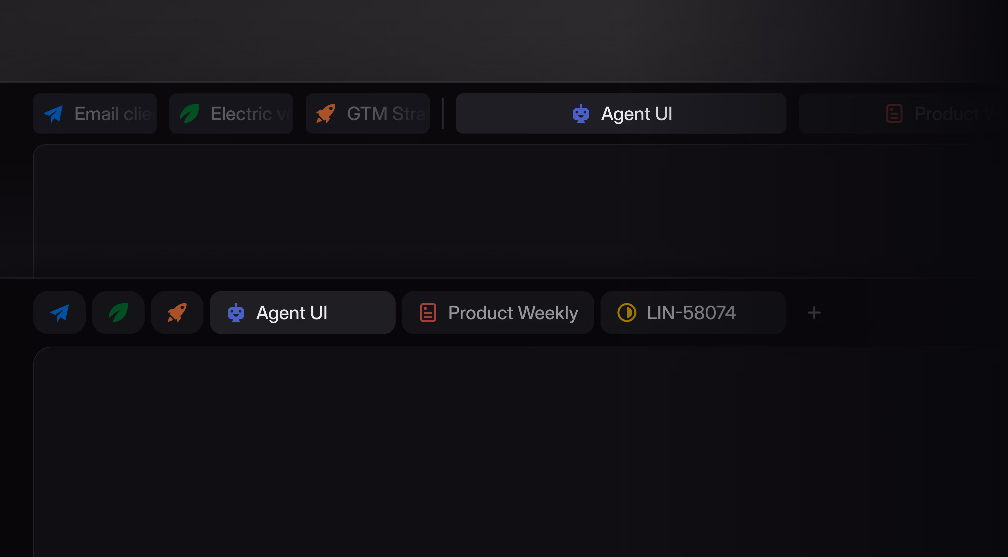
The tab bar compression (tier 3) follows the same logic applied differently. Tabs tell you where you could go; the issue body tells you where you are. Shrinking the tabs from a full-width banner to a compact cluster reduces the constant visual reminder of "other places you could be," which is exactly the wrong prompt when you're trying to focus on a specific issue.
The color shift reinforces all of this: the default palette moved from a cool, slightly blue-tinted hue to a warmer gray, reducing saturation across non-content elements. 1 Icons were also reduced in both size and quantity — colored team icon backgrounds were removed entirely. 1 The cumulative effect is that color now only appears where it carries meaning (a status badge, a priority indicator), not as decoration across the shell.
Whitespace: gaps as grouping signals
Whitespace in the Issue Detail View isn't decorative margin — each gap is a proximity signal that tells you which elements belong together and which don't.
The sidebar's vertical padding increase is the clearest example. 1 More space between nav items doesn't make the list easier to read in isolation — the items are already short, high-contrast text. What the increased padding does is reduce the perceived density of the sidebar, reinforcing its status as a secondary zone. When the sidebar feels loose and spacious, it reads as peripheral. When it felt tight and packed, it competed with the content area.
The border and separator changes are the most instructive move in this dimension:
Aufmann and Heckel acknowledged that separators "had quietly proliferated across the platform, sometimes appearing without clear reason." 1 The fix was to soften rather than remove — edges rounded, contrast reduced, total count decreased. The goal: give users the structural orientation the lines were providing, without the visual noise of hard-edged, high-contrast dividers. "Structure should be felt not seen" is exactly this: the grouping is still there, it just no longer announces itself.
Two adjacent changes extended this logic into space allocation. In April 2026, the Inbox sidebar minimum width dropped from 350px to 300px, 2 giving users more room to dedicate to the content pane. And Agent Chat, which originally risked squeezing the main view when opened, moved to a full-screen overlay on April 23. 3 The pattern across all three changes: when there's a spatial conflict between content and chrome, content wins.
One structural choice that predates the March refresh but still governs the Issue Detail View: on wider screens, the issue content centers rather than stretching edge-to-edge. 4 This is a readability decision that most productivity tools don't bother making. Prose past ~700px of width becomes harder to track across lines. Centering the issue body treats the space around it as intentional whitespace, not wasted canvas.
State changes: behavior tells you what the design values
Eight documented transitions in the March 2026 changelog reveal what the design team considers a "correct" interactive state:
Hover states
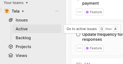
- Hovering over the collapsed sidebar opens it instantly. 2 This was broken before the March 12 release and explicitly fixed — the expected behavior is that collapsed doesn't mean inaccessible.
- Hovering over any interactive element for a few seconds surfaces a keyboard shortcut hint. More on this in the micro-interactions section.
- Hovering over a list row makes keyboard shortcuts fire against that row — not against whatever is keyboard-focused. Tom MacWright (founder of Val Town) called this "really impressive stuff." 5
Focus states
- Filter input focus previously triggered a white flash — a jarring visual artifact that implied a heavier state change than was actually happening. Fixed April 30. 2 The expected state is invisible: a smooth focus transition with no perceptible visual jolt.
- Comment input automatically refocuses after send. 2 Small, but it means you never have to click back into the composer for a follow-up.
Structural states
- Cmd/Ctrl+F now expands collapsed comment threads when the hidden content matches the search term. 2 The design intent: information should not stay hidden when a user is actively looking for it.
- Status icon hit area was enlarged (May 14) so near-edge clicks change the issue status instead of opening the issue. 2 This is Fitts's Law applied precisely: the icon's effective target is now its visual size plus a margin, not just the icon center.
Agentic states
- When a coding agent is actively working, the desktop tab for Issues and Pull Request Reviews now displays an animated indicator. 2 This is the first state class that exists specifically for non-human actors in the workflow — a signal that the state model is evolving beyond person-to-issue interactions.
Reading the changelog as a design spec is a useful exercise. Each fix documents an expected state the team considered "correct": instant hover expansion, invisible focus transitions, content-surfacing search, generous hit areas. When those states break, they're worth filing. When they work, you don't notice them.
Micro-interactions: four that reveal the operating model
The hover-to-keyboard hint system
After a brief pause over almost any interface element, a small banner surfaces showing the fastest keyboard path to the same action. 6 Nicholas Piano (Tela Blog) described it as "the smoothest keyboard shortcut integration system among similar applications." 6
What makes this interesting beyond the interaction itself: it's an onboarding mechanism that only activates when you pause, which means it never interrupts an expert user who's already moving fast. Linear doesn't require you to read documentation to discover its power user paths — it waits for the moment you're stationary and teaches then.
The hover-target shortcut binding
Most apps map keyboard shortcuts to focused elements. Linear maps them to hovered elements. Keyboard focus and mouse position are independent pointers, and Linear resolves them in favor of the mouse when the two diverge. The practical effect: you can keep one hand on keyboard shortcuts while your mouse navigates a list, firing actions against each row without clicking to focus first. 5
Contextual title suggestions
When creating a new issue and typing a title, suggestions surface mid-entry. 6
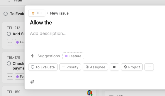
This is progressive disclosure applied to input — you get the suggestions only after you've started, not as a prompt that competes with the blank field. The timing matters: suggestions before you type can paralyze; suggestions mid-sentence help you converge.
Comment send shortcut configurability
The March 12 refresh added a preference for how comments are sent: Enter alone, or Cmd/Ctrl+Enter. 1 The decision to make this configurable rather than prescribing one behavior acknowledges that "casual chat" and "deliberate async communication" patterns coexist in the same product. Enter-to-send reduces friction for short confirmations; Cmd/Ctrl+Enter gives you a moment before committing something longer.
The honest friction point
Linear's editor sits in an ambiguous middle ground between Markdown and a rich text editor — some Markdown syntax works (surrounding text with
_ italics), some doesn't (bracket-syntax links don't render as links). 5 MacWright described this as "an awkward middle ground that forces me to use a mouse more than I'd like." 5 It's the one place in the Issue Detail View where the micro-interaction model breaks: the interface implies keyboard-first but doesn't fully deliver it.What the two principles add up to
"Don't compete for attention you haven't earned" and "Structure should be felt not seen" are not just sidebar decisions or separator choices — they're a claim about where the interface's job ends. Navigation is done once you're looking at the issue. Chrome is done once you understand the layout. The interface's ongoing job is to stay out of the way of the content.
The interesting constraint this creates for PMs: it means the interface has to trust that users will find secondary elements (collapsed sidebar, muted nav, softened separators) when they need them — without constantly advertising their presence. That's a bet that regular users will internalize the layout faster than the cost of occasional discovery confusion. Linear's "Polishing Season" practice — pausing new features to fix subtle interaction breakage 7 — is how they maintain the trust that bet requires. Thirty-five changelog entries between February and May 2026 2 are the operational evidence of that commitment.
The editor's Markdown inconsistency suggests the bet isn't perfectly honored everywhere yet.
Cover image: A calmer interface for a product in motion
Add more perspectives or context around this content.